


安卓前端研习——TabLayout轻松实现页中页
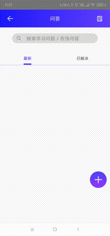
界面设计时常要实现页中页的轮播图或者标签页的效果,TabLayout可以帮助我们轻松实现,具体效果如下:
布局文件设置
首先我们要导入tablayout的依赖,在build中加入如下代码:
compile 'com.android.support:design:23.3.0'
接着我们要创建一个新的布局文件,就使用一个简单的上面tablayout下面是viewpager的结构,代码如下:
    <com.google.android.material.tabs.TabLayout
        android:id="@+id/quest_tabLayout"
        android:layout_width="0dp"
        android:layout_height="0dp"
        android:layout_marginTop="28dp"
        app:layout_constraintEnd_toEndOf="parent"
        app:layout_constraintHeight_percent="0.0625"
        app:layout_constraintStart_toStartOf="parent"
        app:layout_constraintTop_toBottomOf="@id/search_filed_quest"
        app:layout_constraintWidth_percent="1" />
    <androidx.viewpager.widget.ViewPager
        android:id="@+id/quest_container"
        android:layout_width="0dp"
        android:layout_height="0dp"
        app:layout_constraintEnd_toEndOf="parent"
        app:layout_constraintHeight_percent="0.7360"
        app:layout_constraintStart_toStartOf="parent"
        app:layout_constraintTop_toBottomOf="@id/quest_tabLayout"
        app:layout_constraintWidth_percent="1" />
因为运用到了约束布局,所以定位是使用百分比来定位的,其他布局也可通过其他代码实现。
Java逻辑实现
首先我们要为每一个tablayout页分配一个fragment,利用arraylist将他们组织在一起。示例仅使用两页所以只有两个fragment,具体代码如下:
    public void OnSetList(){
        fragments = new ArrayList<>();
        fragments.add(new NewQuestFragment());
        fragments.add(new SolvedQuestFragment());
    }
接着是为viewpager配置adapter,具体代码如下:
    public void OnSetListener(){
        quest_container.setAdapter(new FragmentPagerAdapter(getSupportFragmentManager()) {
            @NonNull
            @Override
            public Fragment getItem(int position) {
                return fragments.get(position);
            }

            @Override
            public int getCount() {
                return fragments.size();
            }

            @Nullable
            @Override
            public CharSequence getPageTitle(int position) {
                return titles[position];
            }
        });
    }
其中,函数public Fragment getItem(int position)返回的是fragment的下标用于获取每一个fragment页。函数public int getCount()返回的是fragment页的个数,所以直接调用ArrayList的size获取其大小。函数public CharSequence getPageTitle(int position) 是为tablayout的每一个标签命名,具体的名字写在了一个titles数组中,具体代码如下:
private String[] titles = {"最新", "已解决"};
函数会为每一个tab标签调用数组中的字符串命名。
因为tablayout与viewpager良好的兼容性,所以同步两者的操作不需要使用像viewpager与BottomNavigationView一样复杂,只需要一行代码便可以完成两者操作的同步。代码如下:
    public void OnSetTabStyle(){
        tabLayout.setupWithViewPager(quest_container);
        tabLayout.getTabAt(0).select();
    }
其中tabLayout.getTabAt(0).select();是设置tablayout显示的默认页(下标0即为第一页)
全部完成后,代码如下:
package com.example.quanta;

import android.os.Bundle;
import android.view.View;
import android.widget.ImageButton;

import androidx.annotation.NonNull;
import androidx.annotation.Nullable;
import androidx.appcompat.app.AppCompatActivity;
import androidx.fragment.app.Fragment;
import androidx.fragment.app.FragmentPagerAdapter;
import androidx.viewpager.widget.ViewPager;

import com.google.android.material.tabs.TabLayout;

import java.util.ArrayList;

public class QuizPageActivity extends AppCompatActivity implements View.OnClickListener{
    private TabLayout tabLayout;
    private ViewPager quest_container;
    private ArrayList<Fragment> fragments;
    private String[] titles = {"最新", "已解决"};

    @Override
    protected void onCreate(Bundle savedInstanceState) {
        super.onCreate(savedInstanceState);
        setContentView(R.layout.quest_layout);
        OnInitController();
        OnSetList();
        OnSetListener();
        OnSetTabStyle();
    }

    public void OnInitController(){
        ImageButton back_btn = findViewById(R.id.quest_back_btn);
        back_btn.setOnClickListener(this);
        tabLayout = findViewById(R.id.quest_tabLayout);
        quest_container = findViewById(R.id.quest_container);
    }

    public void OnSetList(){
        fragments = new ArrayList<>();
        fragments.add(new NewQuestFragment());
        fragments.add(new SolvedQuestFragment());
    }

    public void OnSetListener(){
        quest_container.setAdapter(new FragmentPagerAdapter(getSupportFragmentManager()) {
            @NonNull
            @Override
            public Fragment getItem(int position) {
                return fragments.get(position);
            }

            @Override
            public int getCount() {
                return fragments.size();
            }

            @Nullable
            @Override
            public CharSequence getPageTitle(int position) {
                return titles[position];
            }
        });
    }

    public void OnSetTabStyle(){
        tabLayout.setupWithViewPager(quest_container);
        tabLayout.getTabAt(0).select();
    }

    @Override
    public void onClick(View v) {
        switch (v.getId()){
            case R.id.quest_back_btn:
                this.finish();
                break;
        }
    }
}
设置好看的界面
除了默认的tablayout样式之外,我们还可以自定义实现各种更加好看的效果。
    <com.google.android.material.tabs.TabLayout
        android:id="@+id/quest_tabLayout"
        android:layout_width="0dp"
        android:layout_height="0dp"
        android:layout_marginTop="28dp"
        app:tabRippleColor="@android:color/transparent"
        app:tabIndicatorColor="#6040FF"
        app:tabTextColor="#616161"
        app:tabSelectedTextColor="#6040FF"
        app:tabMode="fixed"
        app:tabIndicatorFullWidth="false"
        app:tabIndicatorHeight="5dp"
        app:tabIndicator="@drawable/indicator"
        app:layout_constraintEnd_toEndOf="parent"
        app:layout_constraintHeight_percent="0.0625"
        app:layout_constraintStart_toStartOf="parent"
        app:layout_constraintTop_toBottomOf="@id/search_filed_quest"
        app:layout_constraintWidth_percent="1" />
这段代码是在原来的基础上增加了自定义圆角指示下划线的效果。
app:tabRippleColor="@android:color/transparent"将按键反馈调为透明,默认情况下是灰色的水波反馈app:tabIndicatorColor="#6040FF"设置了指示下划线的颜色app:tabTextColor="#616161"设置了默认情况下标签文本的颜色app:tabSelectedTextColor="#6040FF"设置了在选中情况下标签文本的颜色app:tabMode="fixed"设置了标签显示的效果,fixed是在标签数较少的情况下使用的,他会将标签平分屏幕的大小,如果有过多的标签数可以选择使用scrolled,即可以滑动的标签选择栏。app:tabIndicatorFullWidth="false"默认情况下下划线会填满整个按钮,将选项设为false下划线就只会与标签中内容的长度相等app:tabIndicatorHeight="5dp"设置了下划线的高度,也就是厚度app:tabIndicator="@drawable/indicator"这是主要设置了圆角下划线的部分
我们需要在drawable文件夹下新建一个indicator.xml文件,并输入一下代码:
<?xml version="1.0" encoding="utf-8"?>
<layer-list xmlns:android="http://schemas.android.com/apk/res/android">
    <item>
        <shape>
            <corners android:radius="5dp"/>
        </shape>
    </item>
</layer-list>
因为圆角的半径设置为了5dp,所以前面讲下划线的厚度也设置为了5dp使效果更加美观。